INFORMATION ARCHITECTURE | PROTOTYPING | TESTING
Redesign of the TD Mobile Banking Experience
Empowering gig workers to save for the future
Empowering gig workers to save for the future

THE PROBLEM
TD Bank's mobile experience was piecemeal, unfamiliar, and does not support better client financial habits
Summary
TD Bank has an opportunity to build trust with its millennial client base by helping them to save for an uncertain future. Currently, clients have little insight into their income trends and spending habits. Not only does the current system do very little to help its clients save, but it lacks coherence, is inefficient, and presents an unfamiliar experience to users.
TD Bank has an opportunity to build trust with its millennial client base by helping them to save for an uncertain future. Currently, clients have little insight into their income trends and spending habits. Not only does the current system do very little to help its clients save, but it lacks coherence, is inefficient, and presents an unfamiliar experience to users.
My Role
My Role
I was responsible for information architecture design, storyboarding, prototyping, testing, and strategy. I completed this project independently over the course of 8-weeks.
UNDERSTANDING THE CURRENT SYSTEM
UNDERSTANDING THE CURRENT SYSTEM
RESEARCH TO UNDERSTAND TARGET USERS
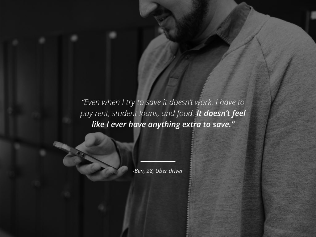
I focused my system redesign on empowering gig workers to be able to save for the future. As such, it was important to understand how gig workers think about savings and what barriers a mobile banking application could help to alleviate.
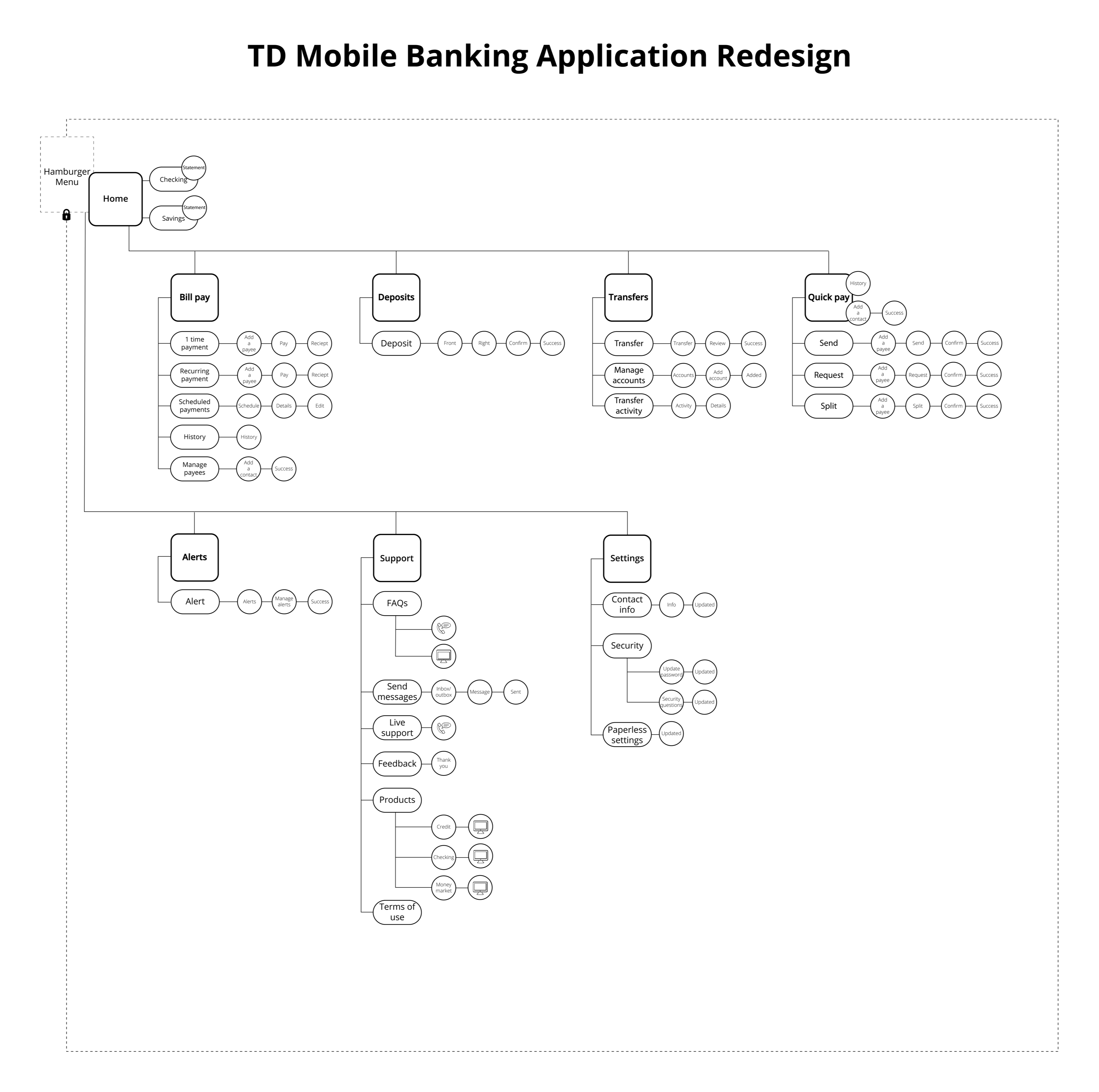
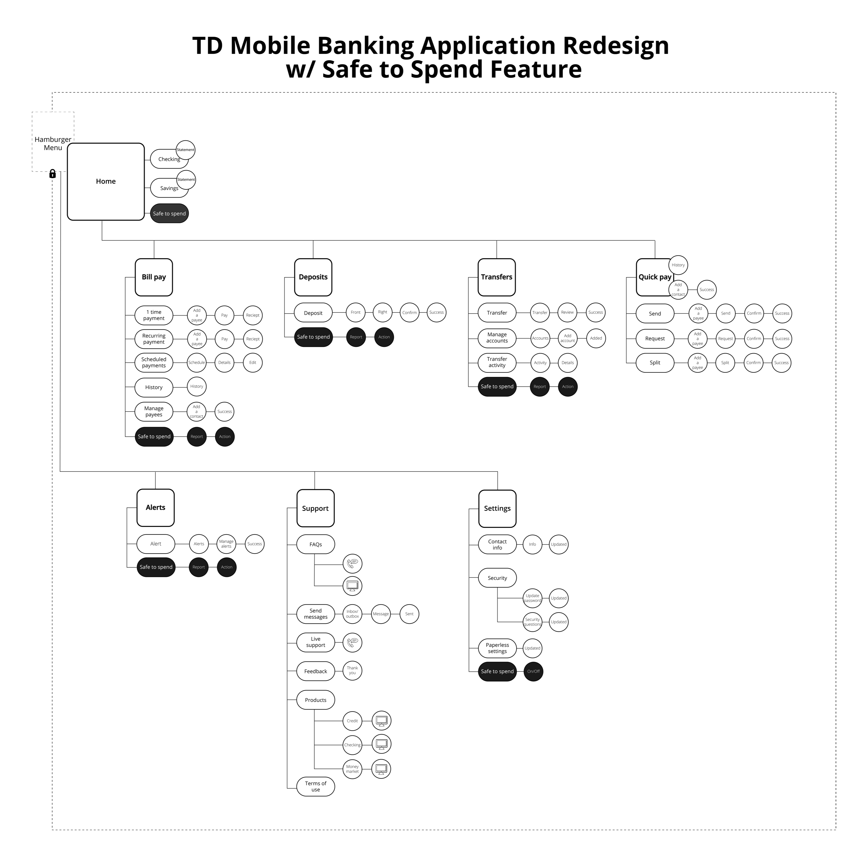
BUILD MAPS TO COMMUNICATE BASELINE AND VISION
BUILD MAPS TO COMMUNICATE BASELINE AND VISION
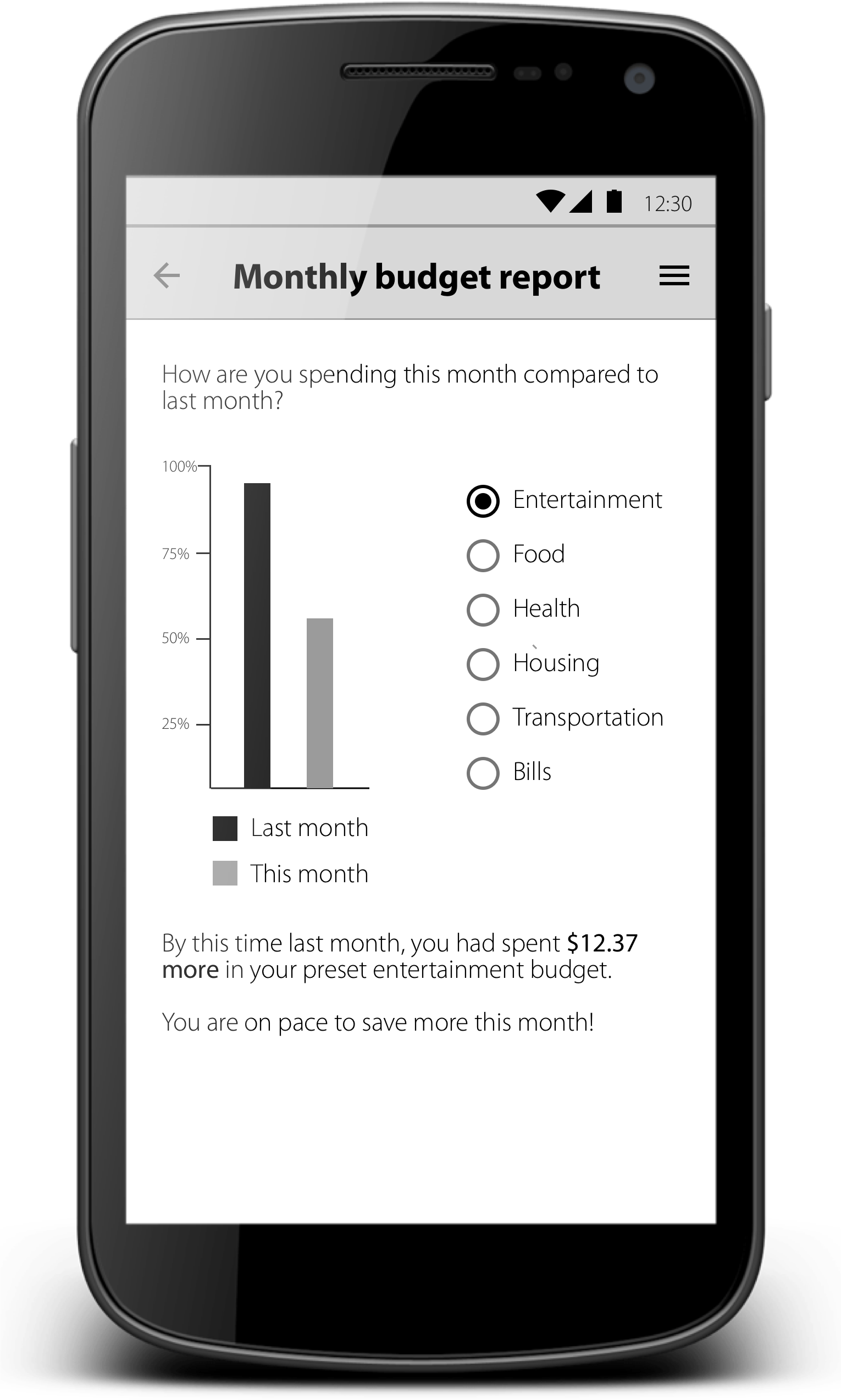
To begin the redesign of TD bank’s system, I analyzed the current system in order to understand opportunities for creating a better customer experience. I used what I learned to map out a more intuitive and familiar system. I then built in a new “safe to spend” feature that integrates into the newly designed experience.
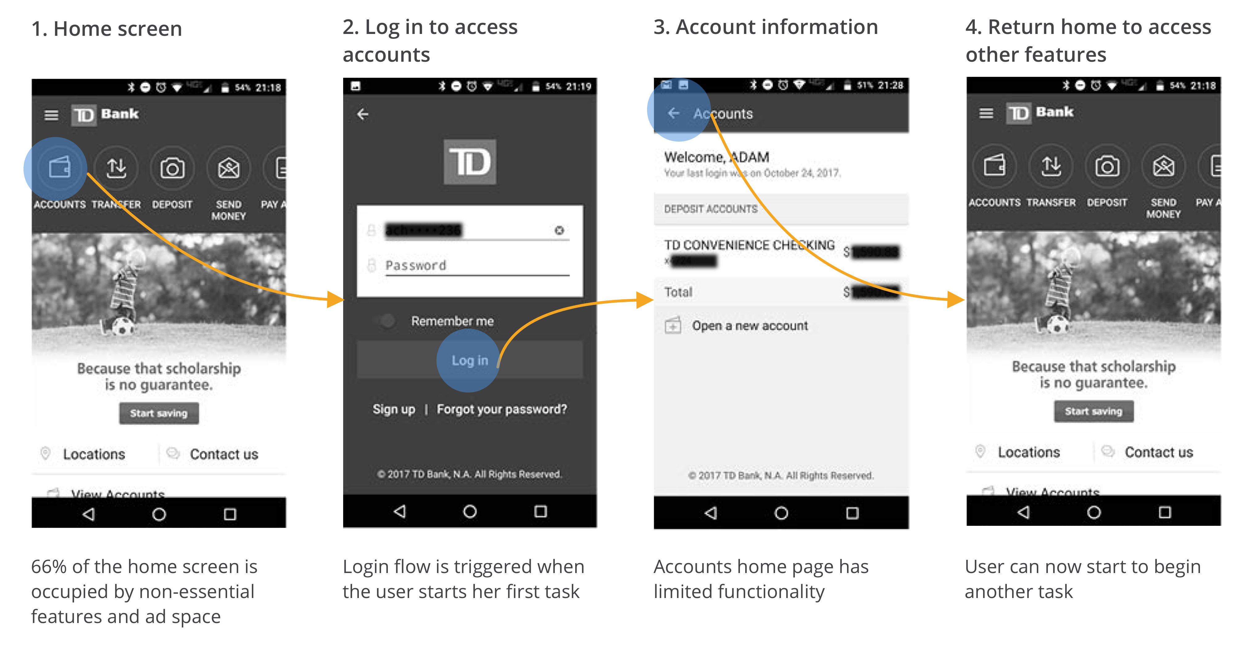
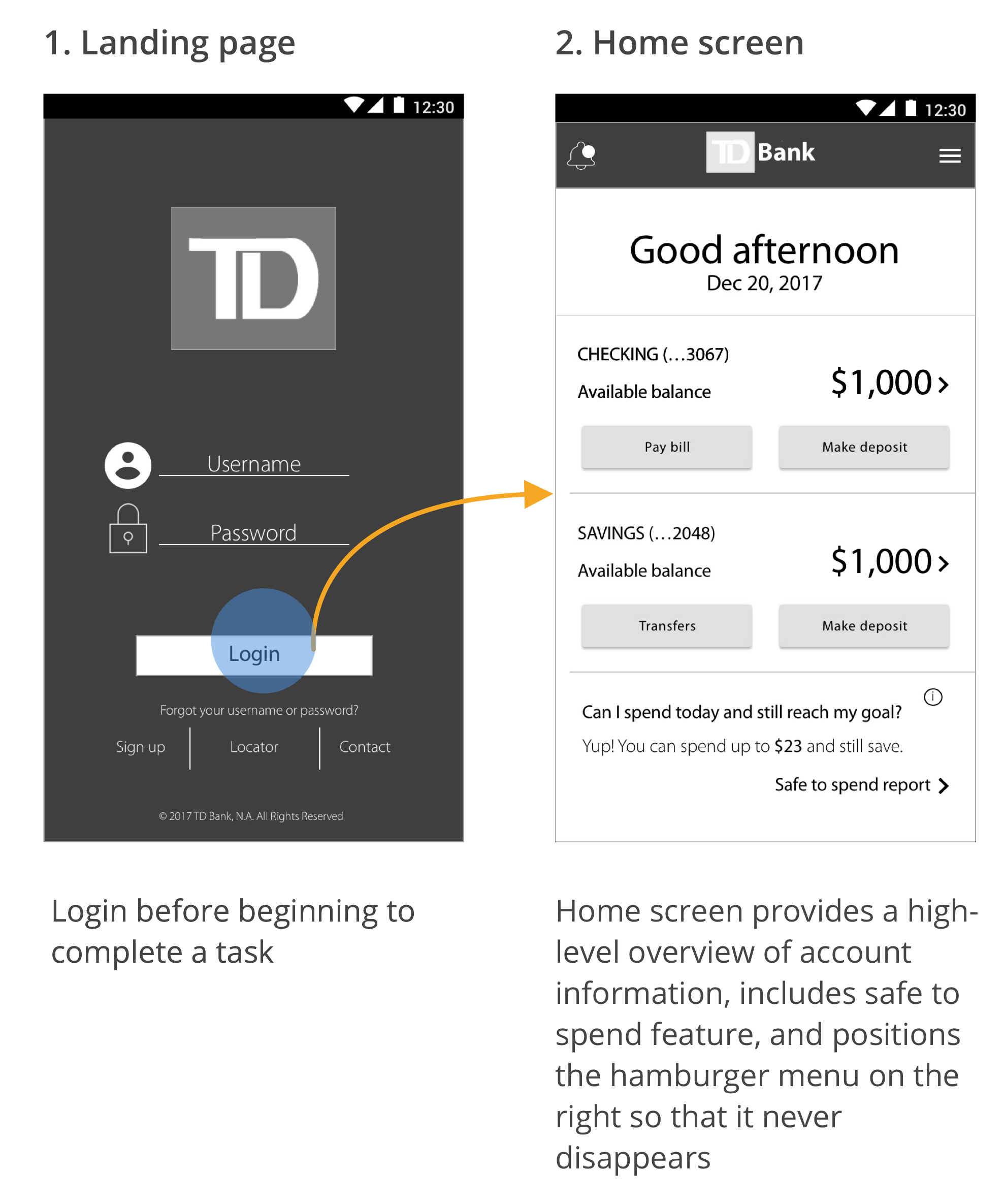
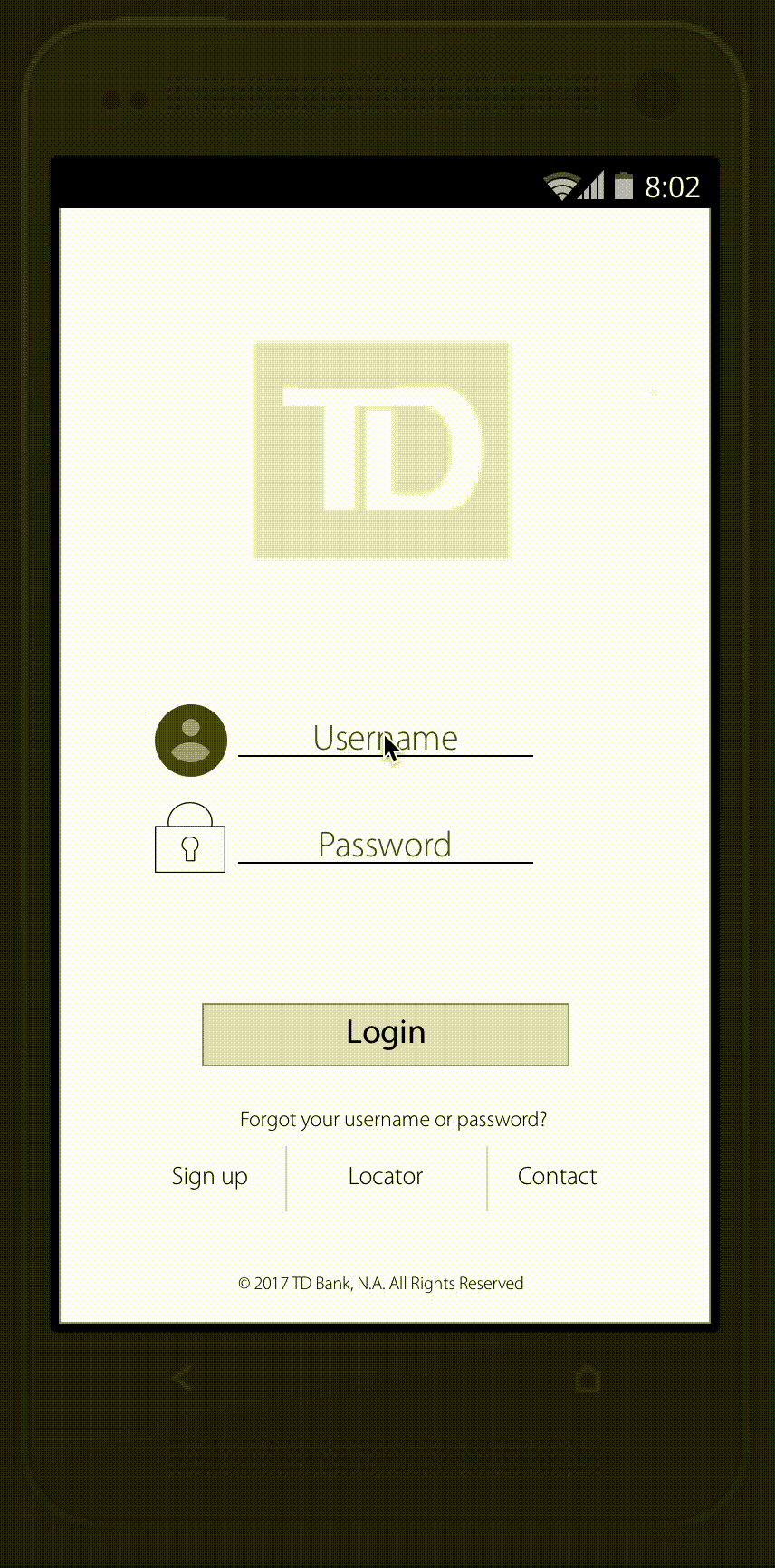
"CHECK YOUR BALANCE" FLOW COMPARISON
Below is an example of how I redesigned one flow in the TD banking mobile application in order to address UI that is unfamliar and does not prioritize user goals.
Current flow
Redesigned flow
USER SCENARIOS, STORYBOARDS, AND FLOWS
USER SCENARIOS, STORYBOARDS, AND FLOWS
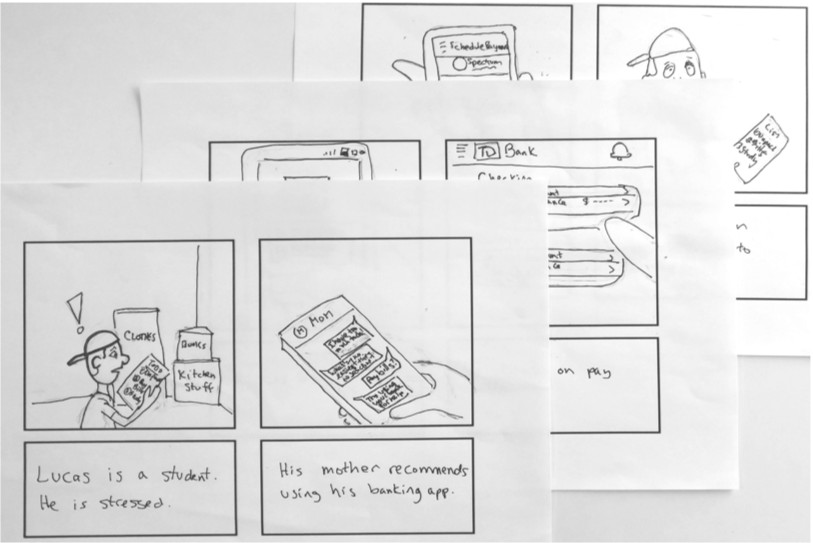
BUILD EMPATHY TO DESIGN EXPERIENCES
In order to empathize with users and articulate their goals, I wrote scenarios, created storyboards and then translated them into wireframe flows.
TESTING AND PROTOTYPING
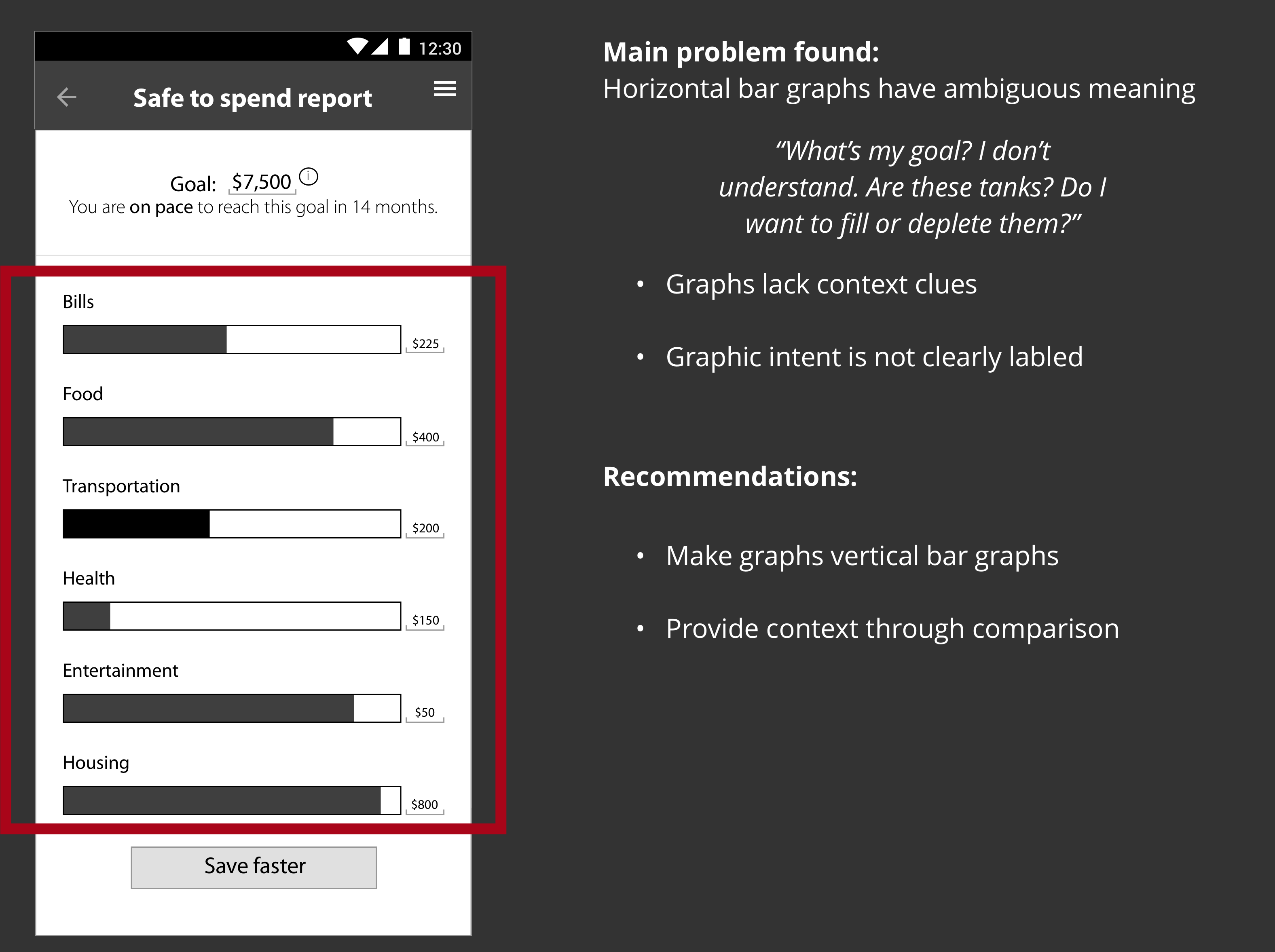
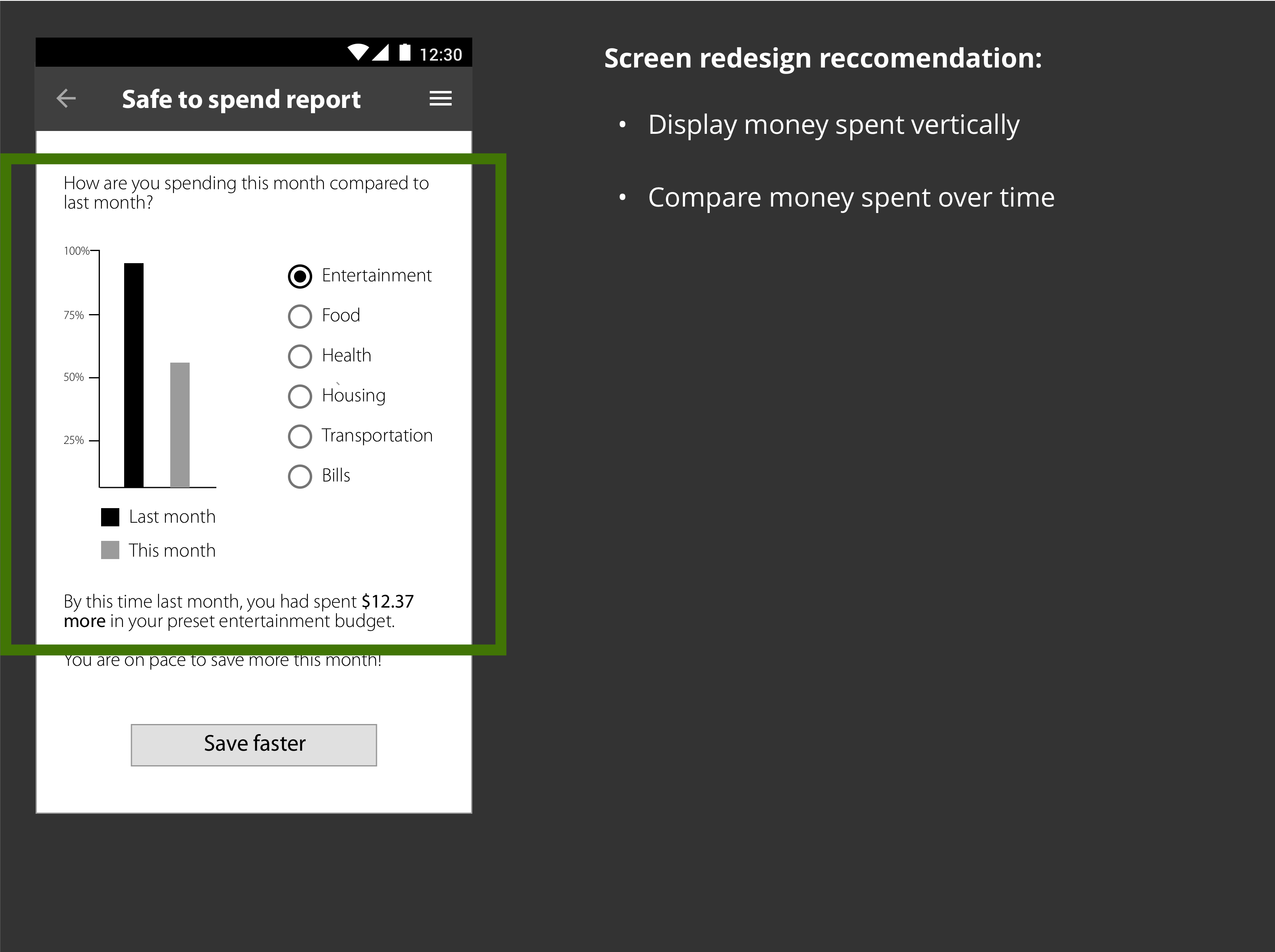
RAPIDLY IDEATE TO IMPROVE THE SYSTEM
From low-fidelity wireframes to an interactive prototype, I used a think-aloud protocol to learn how to build the most effective user experience. I observed users try to achieve typical goals in order to develop hypothesis about how users can better achieve their goals.

MAKE REVISION RECOMMENDATIONS
ARTICULATE STRATEGIC PRIORITIES
I created artifacts to communicate application recommendations, as well as to lay out high level strategy to inform task prioritization.
LESSONS LEARNED
Paper prototypes are an easy, cheap, and fast way to get feedback early and often.
- Paper prototypes are an easy, cheap, and fast way to get feedback early and often.
In order to provide more value to clients, banking application designers and developers should consider those who have the least time and money to devote to saving for the future.
- In order to provide more value to clients, banking application designers and developers should consider those who have the least time and money to devote to saving for the future.
Digital interactions need to fit seamlessly into the user’s flow; otherwise the interaction is either a burden or will never be completed.
- Digital interactions need to fit seamlessly into the user’s flow; otherwise the interaction is either a burden or will never be completed.
Copyright 2019 Adam Chasen